Reflections Bridal Artistry — Brand Redesign
Rebuilding a Bridal Beauty Brand to Match the Artistry Behind It
Brittney ran programs on my agency team for years — the kind of program manager who keeps everyone honest about what good work looks like.
When she left to build her own company with her sister, they already knew who they wanted to design the brand. They said they couldn't think of anyone better.
That is the highest compliment in this business, and the most pressure. This was never a pitch. It was a former colleague trusting me with the thing she had built, and I intended to honor that.
Reflections Bridal Artistry had outgrown its original branding.
As the business grew and its reputation for stunning bridal looks spread, the old dusty rose circle logo no longer matched the sophisticated, luxury experience brides received on their wedding day.
They brought the rebrand to Ahlstedt Design, my own studio, where I lead brand work end to end.
The question became:
How do we make the brand feel as elevated as the artistry?
A bride chooses her artist long before she sits in the chair. She is judging the brand on Instagram, on a business card, and on a website.
The brand had to promise the same calm, polished, luxurious feeling she would get on the day itself.
The name gave us the idea: a reflection. The mirror became the heart of the identity.
I rebuilt the brand from the logo up, so every piece could be reused with confidence.
Logo
A mirror inside the R.
- Full wordmark: flowing script "Reflections" over clean "BRIDAL ARTISTRY"
- Standalone R icon with a hand mirror for social and small spaces
Color
Warm, romantic, timeless.
- Primary: Rose Taupe and Charcoal
- Secondary: Blush, Petal, Cream, and Linen neutrals
Type & Imagery
Classic meets modern.
- STIX Two Text serif paired with Avenir sans-serif
- Soft R watermark for bridal photography
With the system in place, I carried it into the pieces the owners used every day: business cards for co-owners Elysa and Brittney, a watermark for client photos, and a one-page brand cheat sheet so anyone creating content could stay on-brand.
I built the Reflections Bridal Artistry identity and design system through Ahlstedt Design, my own studio — so every new piece stayed on-brand and moved faster.

STIX Two Text, an elegant serif, for headlines and the wordmark, paired with Avenir, a clean modern sans-serif, for body copy and the "BRIDAL ARTISTRY" line.

The standalone R mirror icon works as a social avatar, a stamp on printed pieces, and a soft watermark on bridal photography.
Brand strategy, visual identity design, logo design, and brand guidelines development for the bridal artistry rebrand.
- Brand strategy and positioning
- Logo design: full wordmark and standalone R mirror icon
- Primary and secondary color palette
- Typography system (STIX Two Text + Avenir)
- Image watermark system for photography
- Business cards for both co-owners
- Brand cheat sheet and usage guidelines
A brand should feel like the experience it promises.
This project was a reminder that a rebrand isn't about a prettier logo.
It's about closing the gap between how good the work is and how the brand looks.
When the identity finally matched the artistry, the owners felt proud to share it, and their clients noticed.
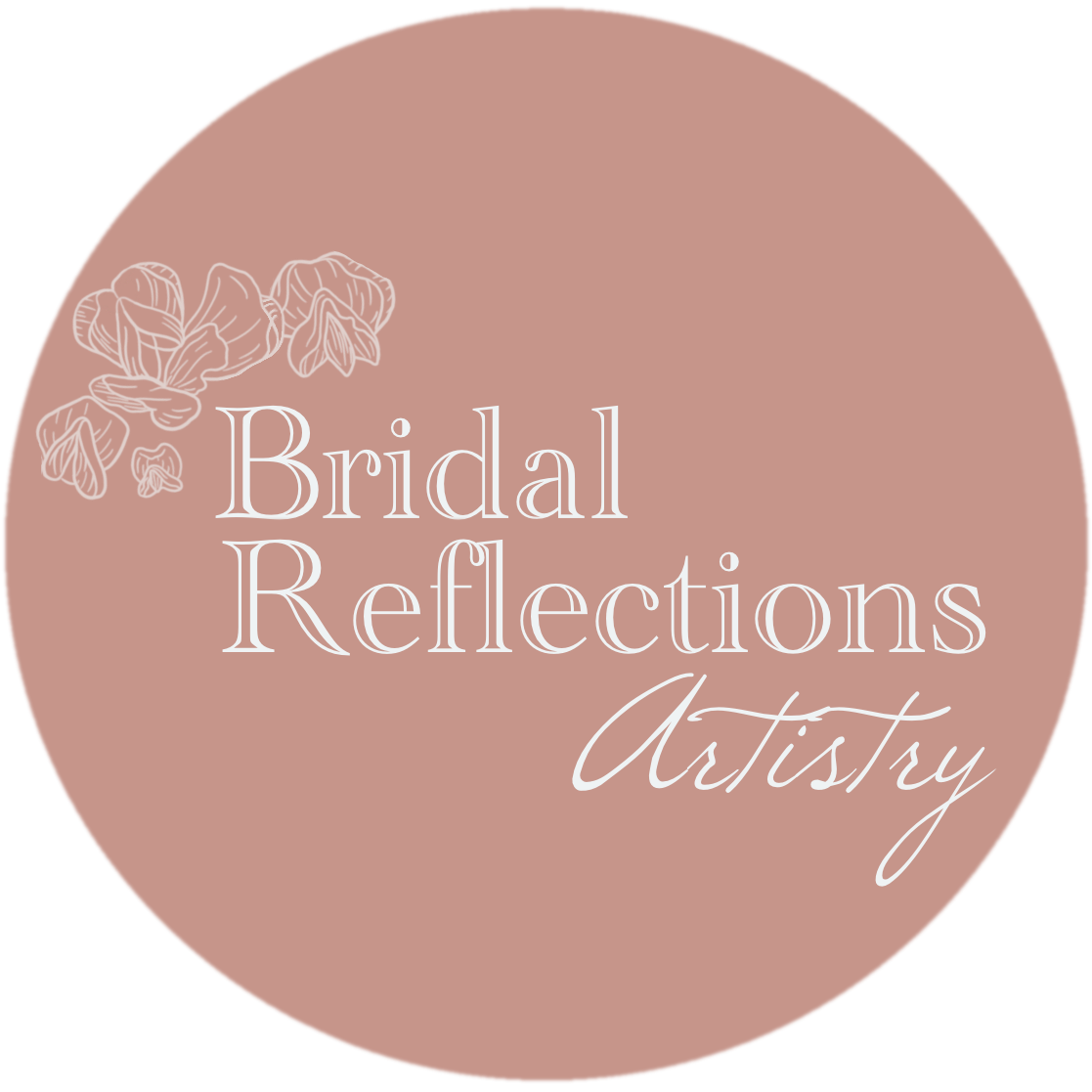
Original branding: dusty rose circular logo with floral accent
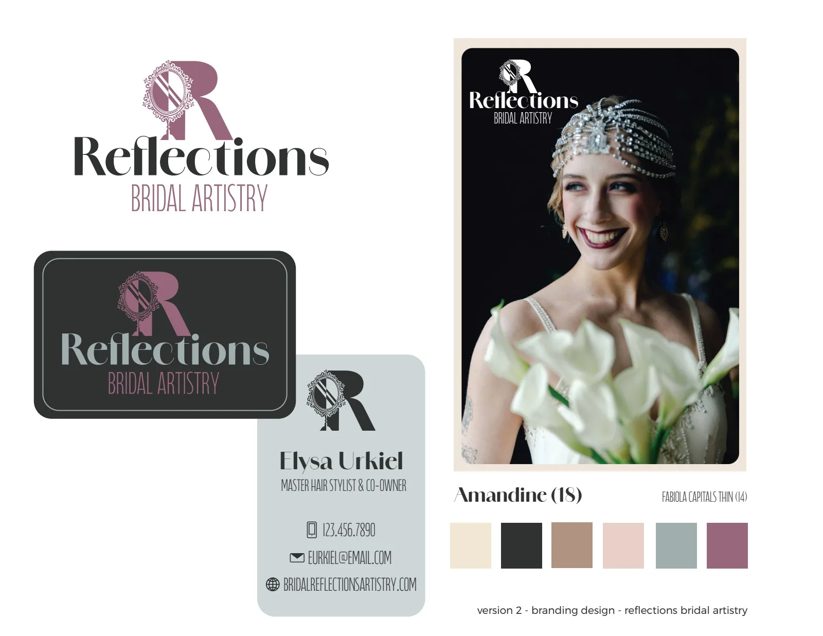
Logo concept exploration with elegant script typography
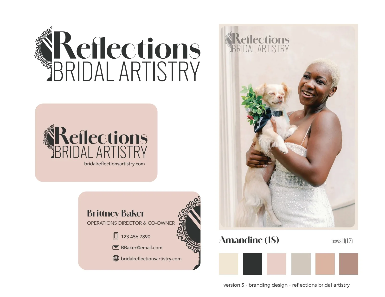
Final approved logo design with refined script and serif combination
Final full-color logo: elegant script paired with sophisticated serif typography
Standalone R icon with hand mirror for social avatars and small spaces
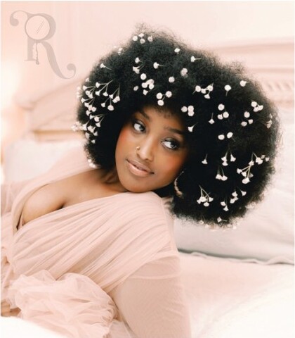
Soft R watermark applied to bridal photography
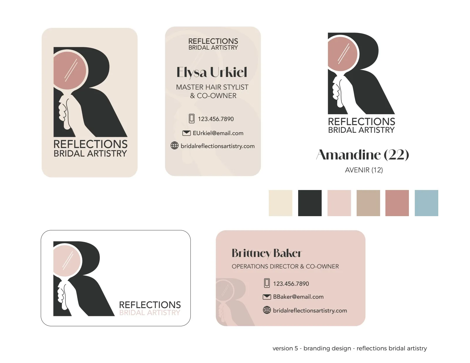
Premium business card designs for co-owners Elysa and Brittney
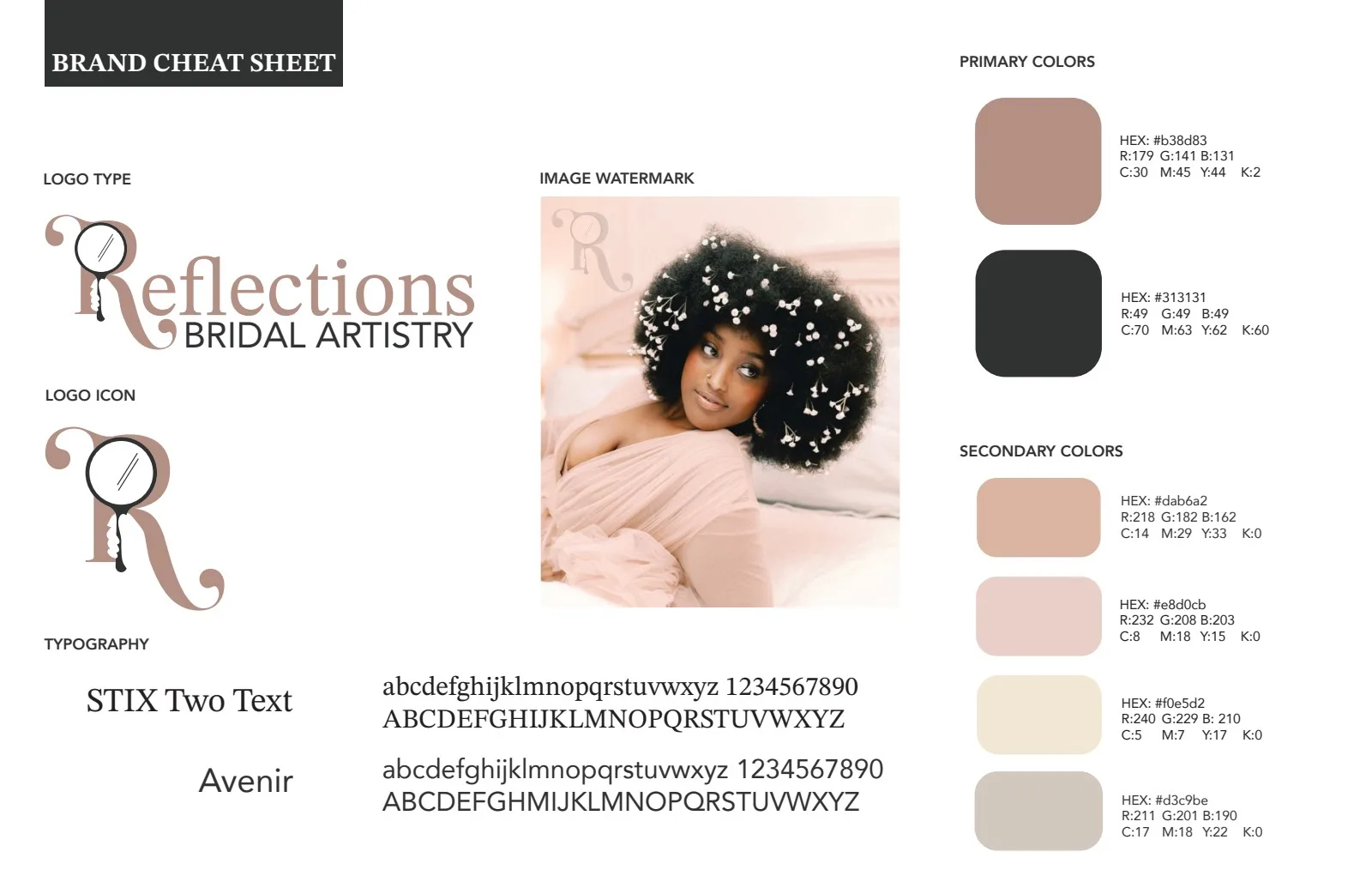
Complete brand cheat sheet: colors, typography, and logo variations
"We were absolutely thrilled with the entire process and the final outcome of our new logo and brand identity. Jamie immediately understood our vision and transformed our initial ideas into a sophisticated, professional, and visually stunning brand that perfectly represents our business - it exceeded our wildest dreams! The new design has elevated our entire look and has been met with overwhelmingly positive feedback from our clients, families and friends. Jamie is professional, responsive, and incredibly talented. We highly recommend her services!"
Operations Director, Reflections Bridal Artistry


Contact
Let's Connect
I'm always open to discussing new opportunities, creative collaborations, or just connecting with fellow storytellers and leaders.
© 2026 Jamie Ahlstedt. All rights reserved.